Branding and packaging design. Brand strategy, concept book, corporate image, web design, web development.
Introduction to the project
The branding and design agency Batlle tackled the creation of a complete brand identity from its initial conception for Global Wine Partners. The brief was not limited to a single product, but rather the development of a whole new range, establishing the branding, the concept book and the corporate image that would define their future in the global market.
The project culminated in the design of the first product of this new family: the packaging for the organic white wine «Frida». This inaugural design was not only to represent the essence of the new brand, but also to serve as a spearhead in highly competitive international markets. The success of this first phase was resounding and incontrovertibly validated: the design was selected as the winner in a demanding tendering competition organised by Alko, Finland's state monopoly, securing distribution in one of the most rigorous markets in Europe.
The Challenge: Defining a Brand Universe from the Ground Up
Global Wine Partners entrusted Batlle to articulate a brand narrative that could be sustained over time and adapted to different products, starting with an organic wine in an organic format. tetrapack 1 litre. The challenge was twofold: on the one hand, to construct a corporate image and coherent; on the other hand, to ensure that the first packaging stand out on the shelf and effectively communicate the values of the product (organic, quality, freshness) to an expert consumer.
Winning the tender for Alko was not a secondary objective; it was the litmus test that would define the success of the launch. This required a graphic design that was not only aesthetically outstanding, but strategically infallible, capable of outperforming numerous international proposals.
Phase 1: Strategy and Concept Book Creation
At Batlle, we understand the branding as the strategic soul of a project. Before drawing a single line, we initiated a process to define the brand's DNA. The result was a Concept Book detailed, a foundational document that establishes the visual universe, the tone of voice and the philosophy of the new range.
Our strategy focused on the concept of «authenticity». We decided to move away from the clichés associated with the wine sector and, more specifically, the «organic» world. We were looking for an identity that breathed modernity, artisanal quality and a unique personality, capable of connecting with a contemporary consumer who values transparency and conscious design.
This concept book established guidelines for the corporate image global, ensuring that each future product, while having its own personality, would share a coherent and recognisable visual language.
Phase 2: Packaging Design as Brand Manifesto
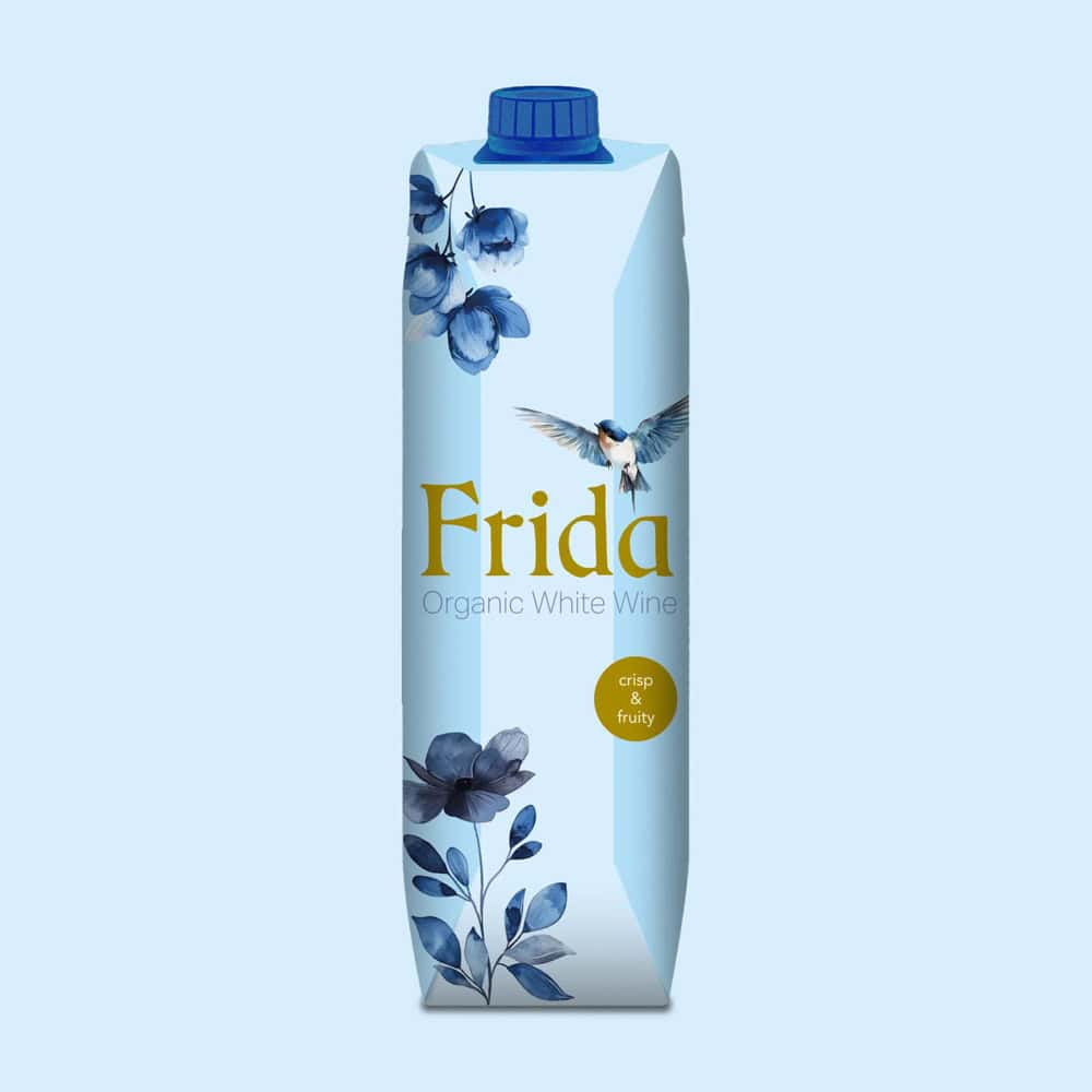
He packaging of the organic white wine «Frida» was the first tangible implementation of this new branding.
The challenge of the iconic and connotation-laden name «Frida» called for a subtle approach. Instead of resorting to literal illustrations or obvious references, we opted for a graphic design that evokes its spirit: personality, a touch of artistic rebelliousness and innate elegance. This was achieved through careful typographic selection and the use of graphic strokes with «soul», giving the packaging the character of a piece of contemporary art.
In terms of «organic» positioning, our strategy was equally differentiating. We rejected the usual use of leafy greens and earth tones. Instead, the Batlle design team developed a colour palette that evokes the mineral freshness of white wine, the purity of the product and a sense of premium quality. The result is a delicate balance: a packaging that is both modern and timeless, that stands out on the shelf with its restrained elegance and that communicates its story clearly and directly.
Phase 3: Web Creation and Digital Ecosystem
Parallel to the development of the physical product, the Batlle team tackled the web creation of the brand. The aim was to translate the strategy and aesthetics defined in the concept book to a seamless and intuitive digital user experience (UX). The web design adhered to the same philosophy of «authenticity» and «restrained elegance».
We were not looking for a simple corporate website, but rather a platform for storytelling that could build the brand universe. The process of web development focused on scalability, responsive design and search engine optimisation (SEO). The ultimate goal was not only to have a presence, but also to build a brand positioning on the Internet solid and durable, with the web acting as the brand's digital base camp, ready to capitalise on the interest generated by the success of the physical product.
Outcome: Trade Validation and Market Opening
The news that Alko had selected our design of packaging above all other international proposals was the ultimate validation of our strategy. offline.
Simultaneously, the launch of the new digital platform provided Global Wine Partners with a crucial tool to capitalise on this success, with its own space to communicate its history, values and product portfolio.
This project reaffirms Batlle's philosophy: the branding, the graphic design, the web design and the web development are not isolated decorative elements; they are a strategic ecosystem. It demonstrates how a cohesive brand identity, which manifests itself with excellence both in a packaging winning physical platform in Finland as well as on a robust digital platform, is the key to the brand positioning on the Internet and the opening of international markets.