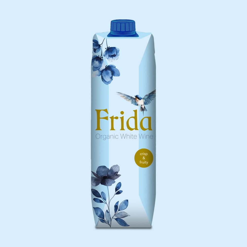
Our packaging design for Frida Organic White Wine triumphs in Finland
At Batlle branding, we are very satisfied with the packaging that we have designed for the Organic White Wine Frida, of our client Global Wine Partners, has been the winner of a prestigious competition organised by Alko, Finland's state monopoly.
This recognition represents much more than an award. To be selected by such a rigorous entity as Alko, in a highly competitive competition, is the validation of our creative strategy and the confirmation that design is a fundamental tool to open markets.
The challenge was to capture the essence of an organic wine that carries such an iconic name. Our aim was to create packaging that was not only aesthetically appealing, but also communicated the product's values of sustainability, quality and freshness. We wanted the packaging (tetrapack 1l) would stand out on the shelf and tell a story of its own.
The fact that Alko has chosen our design to introduce Frida Wine to the competitive Finnish market gives us great satisfaction. It is the culmination of months of hard work and close collaboration with the wonderful team at Global Wine Partners, to whom we are deeply grateful for their confidence in our vision.
This achievement belongs to our entire design team, who after a great deal of previous branding work, have once again demonstrated their talent and dedication.
Our Strategy: Graphic Design as Narrative
We approached this project not as the creation of a label, but as the development of a branding 360 degrees, concentrated in one bottle.
Our strategy of graphic design focused on «authenticity». We decided to move away from the visual clichés of organic. Instead of limiting ourselves to leafy greens, we opted for a colour palette that evoked the mineral freshness of white wine. We wanted the consumer to feel the craftsmanship and care that went into the product even before opening the bottle.
For the «Frida» concept, we decided not to be literal. Instead of an obvious illustration, we worked with typography and graphic strokes that suggest personality, a touch of artistic rebellion and elegance. The packaging design It had to feel like a piece of contemporary art: clean, but with a soul.
The result is a delicate balance. A branding that is both modern and timeless, that stands out on the shelf for its restrained elegance and that tells a clear story: «I am an organic wine, I am premium quality and I have a unique personality».
The Immense Satisfaction of a Job Well Done
The news that Alko had selected our design over all other international proposals was greeted with a profound sense of achievement. It is the culmination of a symbiotic collaboration with the Global Wine Partners team.
We are deeply grateful to Global Wine Partners for their trust. Their courage to approve a design that dared to be different and their unwavering commitment to product quality were the foundation on which we were able to build this success.
This victory reaffirms our philosophy: the packaging design is not an ornament; it is a strategic business tool. It is the physical manifestation of the branding and the most important bridge between the product and the consumer.
Seeing how our creative work translates directly into the opening of a market as complex and prestigious as the Finnish one fills us with incalculable professional pride. This satisfaction is the engine that drives us to continue innovating and to continue believing in the power of good design.
We are delighted to see our Frida Organic White Wine packaging design on the shelves of Alko, bringing a piece of our work and our client's vision into the homes of Finland.

